|
I ended the first part of this 2 part series with a more or less completed painting of my Black Lab, Arleigh, but no background or other elements. To remedy that, I wanted the painting to tell a story, and whatever I was to add to it needed to be in service of that. Arleigh is definitely an alpha dog - she has to be in charge. As a cartoonist, I often write using juxtaposition as a launch point for creating humor, and that's what I did here. 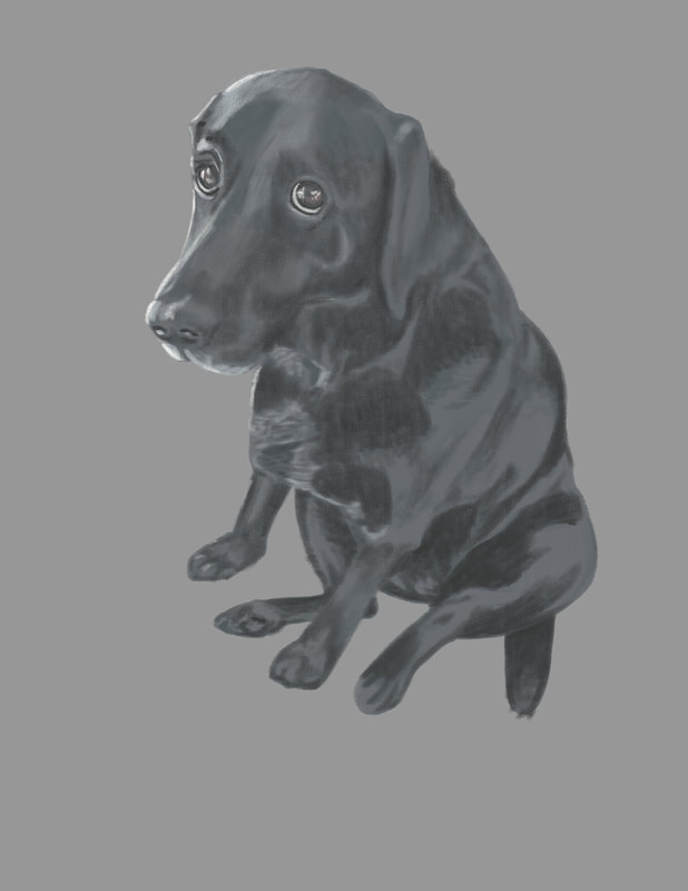 I decided I would add a cute kitten and Arleigh's bed. The expression on Arleigh's face could be interpreted in a variety of ways, but when I looked at it, a rough scene or scenario sprang to mind. Step one, I needed to find visual references to add to the painting. Arleigh's bed was easy and accessible, although I knew I'd need to modify it to add more to the story of the picture. I also needed it to be in at least somewhat similar lighting conditions, so I placed near a window and took this image. 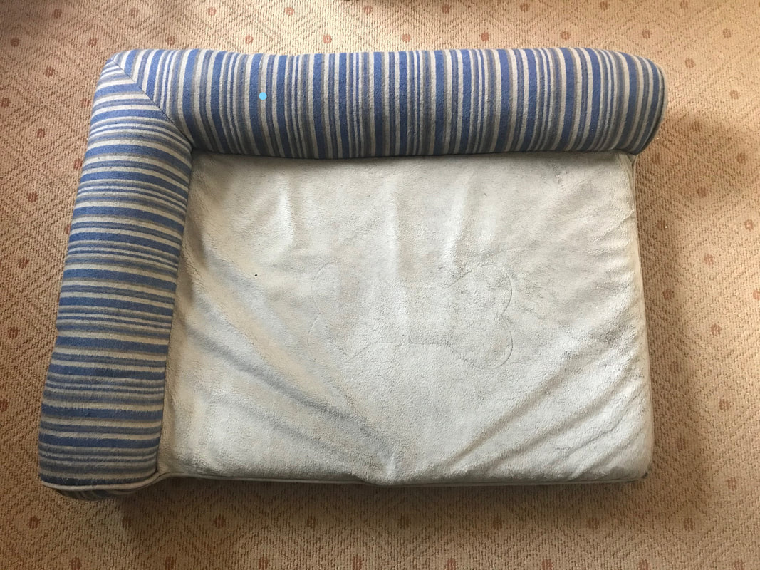 Next up, I needed a cute sleeping kitten image, so I put on my thinking cap and pondered the search phrases I would need to use to find just what I was looking for, and came up with, "sleeping kitten image." Brilliant, no? I couldn't the colors and pose I wanted, so I studied several photos and created my own. Like a Doctor Frankenstein of kittens. So I've got that going for me. Next up, I needed to elongate the canvas so I could situate the additional elements into the painting. I kept everything at 300dpi, so my computer wouldn't protest too much under the strain. Next up, a rough sketch of Arleigh's bed with a few enhancements and simplifications to better tell the story, and not push my very limited digital painting skills. 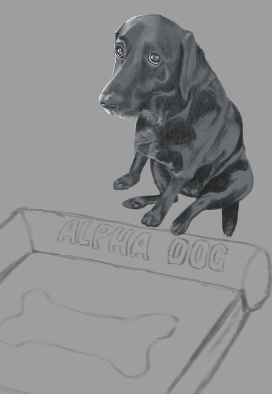 Nest up was the sketch of the kitten. I rough penciled it in and placed it where I thought it made most sense for our visual story. 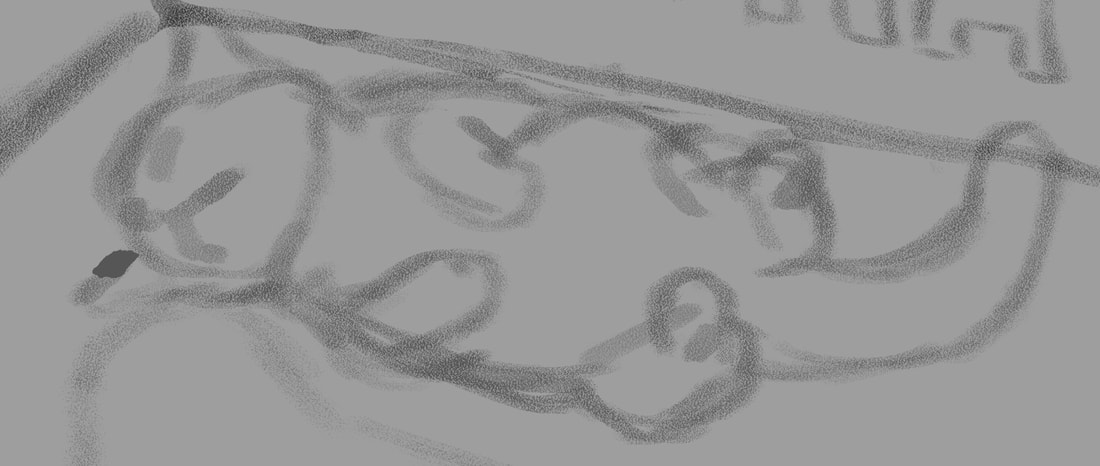 Next on the list was to start adding local color, or the color of an object as it is without being overly influenced by light or shadow. 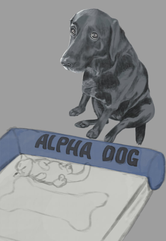 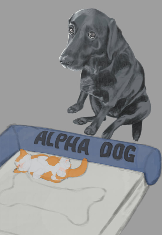 Once all the elements were added and the local color decided on (I couldn't find any kittens with that specific coloring - I wanted the orange to balance the blue of the bed, so I came up with that color mix for its fur), it was time to add values. One of the things I've heard repeated in virtually all of the digital painting courses I've taken is push and pull - to go back and forth between dark and light as you work your painting. So I started with a shadow layer, then a layer for adding lighter areas, then back and forth till all of the values were completed, or at least as complete as I could make them. After a final pass of subtle light and shadow, I needed background. I wanted something simple to keep the eyes on the subjects in the painting, and we happen to have a wood floor in our home. I didn't like any of the photos I had, so I did an internet search for "old wood floors" and found one that might work. I changed the orientation to match the setting, the adjusted hue/saturation and color balance, added a soft light coming from the left of the image to match the light on the subjects, the finished with a gausian blur to keep the subjects clear in the foreground. It didn't come out quite as I'd hoped - the light doesn't match as it should, there are a good number of imperfections in both the drawings and the painting, but I consider this one of the steps in a much longer learning process. You have to step in the arena no matter your perceived imperfections in skill. That's where the skill will be acquired - in the doing. So here's mine, warts and all, and on to the next. 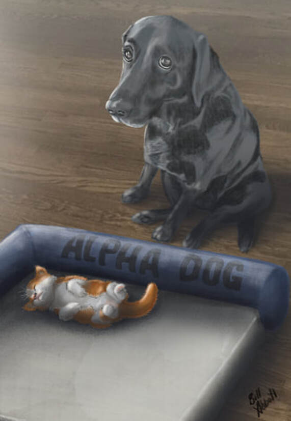
0 Comments
Leave a Reply. |
AuthorIllustrator and Cartoonist Archives
February 2022
Categories |
 RSS Feed