|
I’ve been blessed in more ways than I can count, from my family, friends, colleagues, and acquaintances, to the gifts God has bestowed on me, however unremarkable they may be and as undeserving as I am to receive them. As I pursue my love of maritime art farther and reflect back on the forces that drove me in this direction, I can say with absolute clarity the point at which this seed was planted. My great grandparents, Tom and Fannie Hoyt lived in a modest home on Plum Avenue in Troy, New York, and my mother would walk my two sisters and I there in fair weather, or pull us in a sled in the winter from our upstairs apartment on Billings Avenue, a half-mile or so from their house. Among my earliest memories are fuzzy glimpses back to their living room - a blue-green couch of 1950s vintage, atop of which sat a small faded black pillow with gold-braided embroidery. The pillow was filled with long-since dried balsam needles which, when crunched gently in your hands would release the most beautiful scent - like that of a pristine pine forest after a summer rain. And directly above that pillow hanging in the center of the wall was a framed picture of a ship. 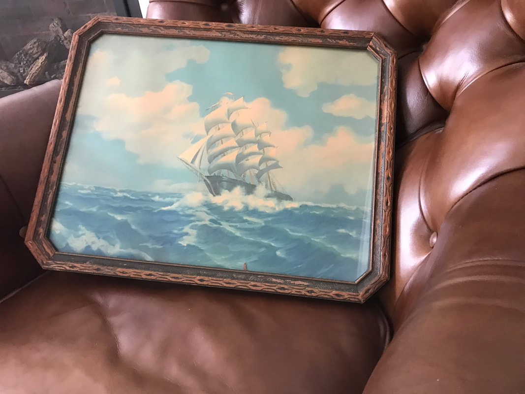 Hokey as it may sound, I immediately loved that picture. An unnamed sailing ship, from some unknown place sailing in a stormy sea to some other unknown destination, with who knows what happening in between. The countless stories and adventures gleaned from the ambiguous aspects of that image filled my head and occupied me for hours. Every visit to my great-grandparent’s home was eagerly anticipated, at least in part, so that I might sit and immerse myself in front of that painting. What was it like to stand on the fore deck at the moment this image was captured? Who were the sailors braving the storm? What must it have felt like as the ship bobbed and weaved its way through the undulating seas, rising toward the sky at one moment, and an instant later plummeting into the back of the next frothy wave, the shock and vibrations transmitted through the ships timbers into the courageous souls standing unsteadily on deck? The sea thereafter held an inescapable romanticism that’s remained with me all of my life. When my great-grandparents’ long, fruitful lives had come to their natural end, the picture found itself hanging on the hallway wall of my grandparents’ home on Lucille Court in Wynantskill, just a couple of miles from the Plum Avenue address. I was in my teens then, and my grandparents would employ me in mowing the lawn, trimming the hedges, digging out tree stumps, or whatever else my old-time farmer grandfather could find to expend my energies in more useful ways than I was otherwise more naturally inclined. When the work was done, I would pass the picture hanging in the hallway, pause a moment and take it all in. My grandmother would see me stop at the image, and note my interest. As the years passed and my own adventures on the sea with the Navy were well under way, my grandmother never forgot about my connection to the picture. When the sad day arrived and my grandmother lived no longer, the picture was to be handed down to me, and where it now hangs in my living room. The picture itself, as I came to find out later, was painted by American/Canadian artist R. Atkinson Fox and apparently sold in the simple but, to my eye, elegant frame it’s existed in for generations. The colors have noticeably faded, at least from the way they’ve appeared in my memories of a half-century ago, but have lost nothing of the magic that’s held me from the first moment I first saw it. To paraphrase Shakespeare’s Prospero, truly the stuff dreams are made of. 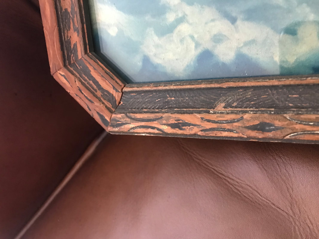 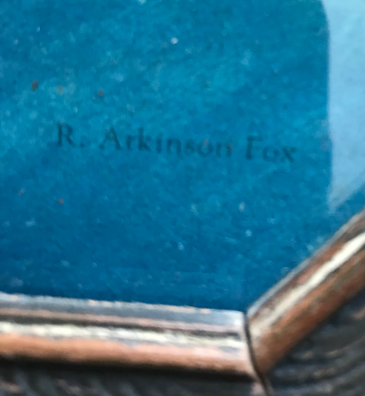 Now that I’ve arrived at a place in my life where’s I’m afforded the opportunities to pursue the meaningful rather than the functionally expedient and financially necessary, I turn my efforts seriously and with conviction toward maritime painting. It’s life turning full circle for me, returning to that magical moment. As I learn, practice, fall short and try again, it’s my hope and now greatest aspiration to create a piece of art that someday will speak to someone as this painting spoke to me. Maybe a small child who looks at something I create, feels the magic and finds in it the seeds of a life of adventure and infinite possibility. That’s a mighty lofty goal, but one well worth pursuing.
0 Comments
What could be better than the marriage of two life-long passions? Maritime history and art have been an absolute joy to pursue and explore, and it’s my good fortune to live in an area that offer both in abundance. As I learn to create art that’s more illustrative and, hopefully, more realistic and interesting, one thing is clear: to emulate the artists I most admire who followed a clearly defined process, I need to define my own. After some trial and error, step one is research - online, through archives, and in-person at the locations of the events I’m hoping to paint. Going from a broad, geographic view, then focusing in on places and objects within that area, I start with the Buffalo harbor and waterfront from the first half of the nineteenth century. Buffalo was positively booming with commerce, travel, transportation, architecture - a bustling city that ranked second only to New York City in size and wealth during that era. 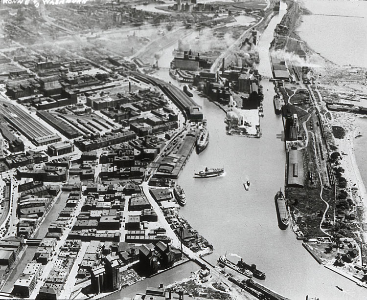 Aerial view of Buffalo Harbor taken in 1924. The topic most interesting to me, at least at this time, is the ships and shipbuilding that were conducted in Buffalo - ships, some of whom went on to see service with merchant fleets during the Second World War and were tragically lost in the Battle of the Atlantic to wolf packs of lethal German U-Boats. Others outlived their usefulness and were scrapped by the Ford Motor Company only a few short years after their completion, having been built in 1918 to supply the materials of a war that ended within a year of their launch. In particular, “Lakes” class freighters that had the stereotypical tramp steamer appearance - tubby, squat, but built solidly enough to survive the brutal North Atlantic Ocean in time of war. Somewhere in the neighborhood of a dozen of these vessels were built in Buffalo by the American Shipbuilding subsidiary, the Buffalo Drydock Company. 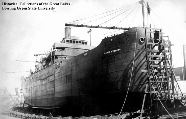 The Lake Furley, as seen nearing completion at the Buffalo Drydock Company in 1919. Sadly, her career was brief and ended as scrap for the Ford Motor Company only seven short years after this photo was taken. Having selected a key object to include in a future painting or paintings, as the case is likely to be, it’s time to determine the setting. Another captivating element of Buffalo history is its architecture, or in this case, it’s infrastructure. The Lake Furley would have slid down the building ways into the Buffalo River, and proceeded west beyond the Michigan Street Jackknife Bridge, itself an engineering marvel. After a good deal more research, including drives to where it once had spanned, and photos of the area as it now appears, I chose the open, and beautifully constructed bridge as part of the picture I want to make. 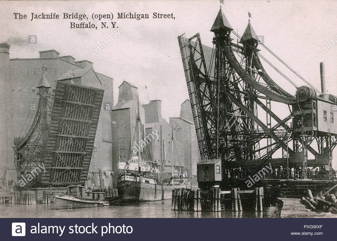 The Michigan Street Jackknife bridge, which spanned the Buffalo River from 1897-1929. In order for a picture to connect most effectively, there has to be a human element. Fortunately, the Buffalo area is rich in historical imagery of the waterfront and the activities that took place there. Images of “Scoopers”, or the men (often Irish immigrants), who climbed into the deep and dangerous holds of grain-laden vessels to shovel, or scoop the grain as it was loaded and off-loaded are fascinating to view and might find a place in a painting. Images of children standing at the dock’s edge to watch the ships narrowly passing one another, and vintage photos of dock workers, fishermen, and casual onlookers from the period all offer interest that could be included. Small harbor tug boats, with their crews standing by to receive or cast off lines on deck, and their captains attentive at the wheel as they negotiate a busy commercial waterway with very little room for error offers additional possibilities. Finally, it’s time to begin sketching - the place in the process I am now. Taking all the interesting elements, and placing them within a limited space to make the picture interesting, historically accurate (or as accurate as can reasonably be achieved without sacrificing the story we’re trying to tell with the picture), and believable with respect to perspective, color, and values - not an easy task. This is my first, rough sketch which will constitute the under-drawing of my future digital painting. I’ve included the Lake Freighter passing through the Jackknife Bridge, the buildings that were in existence in the background at the time, a harbor tug meandering near the pier, and the kids of the era watching it all as it takes place. The sketch has more work to be done - one of the things I’ve learned painfully and repeatedly is the painting suffers when all the small details aren’t worked out beforehand. This sketch is a compilation of vintage images, altered to suit my purposes in picture-making, and which will hopefully become a digital painting worth the time to view - stay tuned. 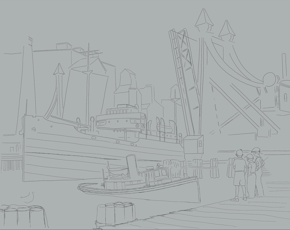 The first, unfinished sketch which includes all the elements of interest I want for my painting.
Here's a quick video of the thumbnailing process I use to work out perspective, placement, background, lighting, and values. It's very rough - I didn't use references to guide me - it's more about getting a feel for where I go with the painting. This will likely be the first of a bunch of thumbails as I get closer to creating something I'll be satisfied with. By the end, I hope to have a series of 10 or 12 paintings of Lakes class freighters that will ultimately tell the story of their history in Buffalo, NY, where a number of them were built. All of my life I've loved the sea, and after a 24 year career in the U.S. Navy, it feels woven into my DNA. As an artist, there is no subject, other than my family, I could paint with more passion and feeling. There's so much in this area I'm interested in: the modern Navy vessels I served on, historic ships of the line, fishing vessels, work boats, the characters who made their livings on the sea, and the topic I chose for my first painting, tramp steamers. As a resident of Buffalo, NY, there's so much relatively unknown maritime history that deserves its place in the public's awareness. A number of freighters - "Lake" class freighters were built on the Lake Erie waterfront in Buffalo and went on to serve in both World Wars. A few even continued service into the 1960's - a sign of a well built ship. Step one in my maritime painting process is research. I studied photograph's, builder's plans, and the work of other artists to get a good feel for the vessel, and began thinking about how I'd tackle it. Once that was figured out, I went to the Wacom Cintiq and began sketching. 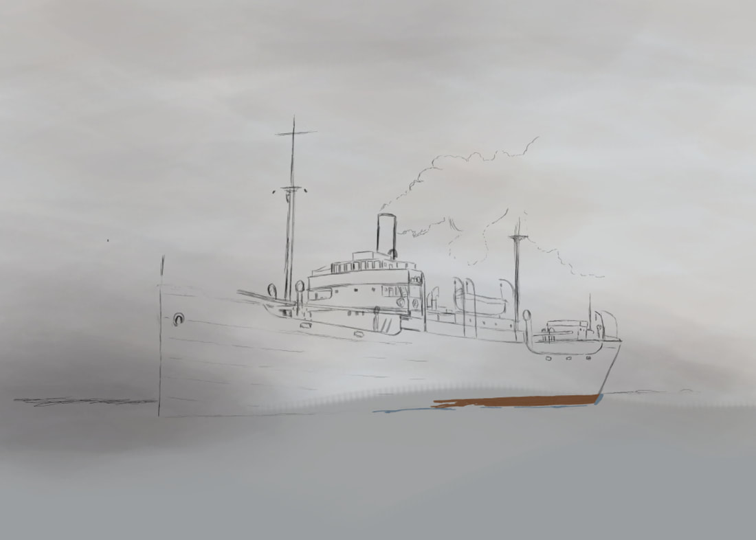 Once I had the basic ship structure penciled in, I wanted a setting that would be dramatic, and would add to the interest of the completed image. I did days worth of internet searches looking for a stunning coastline to add, and settled on Phuket Harbor in Thailand. Massive rock structures jutting out of the ocean, brilliant green foliage and azure seas - perfect, or so I thought. 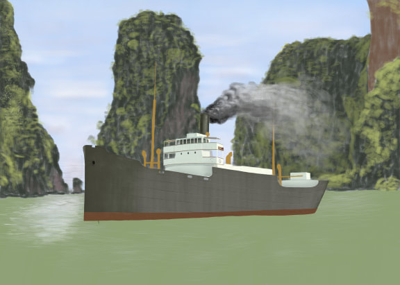 One lesson I learned mighty quick - I took on way more than I should have for my first maritime painting. I'd never painted landscapes before, let alone ones of this complexity, I'd never painted so much as a canoe, let alone a large ship, and never painted water, a very challenging subject in and of itself. I turned to an iPad to work out some quick thumbnail sketches to figure out how to attack the light source and how that would impact the values on the ship, sea, and surrounding land masses - a video capture is below. I'm fortunate to have a large group of people on social media to share my work with and to hear their feedback. I heard some great suggestions, and decided on pulling back on some of the elements I initially added. Smoke from the stack from a ship at anchor seemed inappropriate, so I omitted it. The large rock structure immediately behind the ship became a distracted and was somewhat confusing to the eye - it drew the viewer away from the focal point, which I wanted to be the bridge and midsection of the ship. Initially, I'd intended to paint in sampans and create a waterborne commerce scene, but I ended up passing on that. I painted in a storm in the background with the sun breaking through on the port (left) side of the ship, partially obstructed by a landmass out of view on the right side of the image. For the sea, I wanted it to be a bit choppy, as though riled from a recently passed storm, but not much so it would change the character of the image. All in all, I'm pleased with what I was able to achieve and realize there's a universe of things I have yet to learn - and that's appealing. Learning is an integral part of the joy of creating art, and I look forward to it. The completed piece: 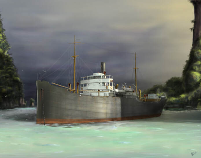 I passionately love the sea, and all things associated with it, both past and present. One of my lifelong aspirations is to create maritime paintings worth seeing, and since none of us are promised tomorrow, there's no time like the present to begin. The first object to tackle is the subject. There's something romantic, adventurous, and a little mysterious about the tramp steamers of old, making their way to ports where opportunities may or may not await. The mariners that crewed these ships were tough, self-sufficient, and with a wealth of stories all their own. As a subject for a first-time maritime painter, the tramp steamer, specifically the Lakes class freighters built during the First World War in Great Lakes ship yards, fit the bill pretty well. The ships are relatively uncomplicated with their basic, boxy shape, straight lines, and easily researched references. With the subject selected, it's time to create the first rough sketch. I use Photoshop CS5 with a Cintiq 24" HD monitor, but the digital process I use is almost exactly the same as using a traditional piece of paper and a pencil. I study multiple reference photos to be sure I understand all the objects on the ship I'm looking at, and will therefore create in the drawing. Once the rough sketch is complete, I then begin a more refined sketch, capturing additional details, refining, and making more clear what will subsequently be painted. 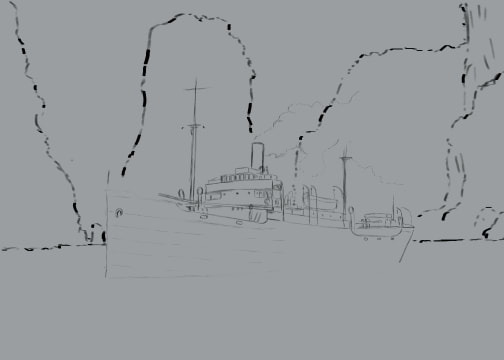 Once the object is sketched out, I need to focus on the setting and background. Every stand-alone painting should, in my opinion, tell a story - be part of a larger narrative, seen or unseen, like a piece of visual literature. Knowing the limitations of my skill level at this point, I decided to set the ship in placid, reflective water. To do so in the middle of the sea would make the painting utterly boring and lifeless. In order to add story to the ship, where water wouldn't play a more dramatic role, the setting is crucial and needs to be well chosen. After a good deal more location research, I came across images of Phuket, Thailand - I don't think I've ever seen a more dramatic set of land formations than those naturally created there. Now that the physical elements are decided on, the next character to be fleshed out in this story is the light - where will it be in the sky, how will it impact the subject and the supporting characters of sea and landscape, what time of day would create the most dramatic lighting? To sort this out, I used my wife's iPad and the Procreate digital drawing app to do a very quick (3 to 5 minutes) thumbnail sketch of how I might approach the light. I'm still not settled on this, but thumbnailing certainly aids greatly in solving that visual problem. Since this painting still has quite a way to go before completion, the lighting I choose may change multiple times. I'll keep experimenting and trying to dial up more drama and interest. In the meantime, flaws and all, and very much incomplete, here's where the painting is as of this date. I'll update as I go, and thank you for allowing me to share this with you. 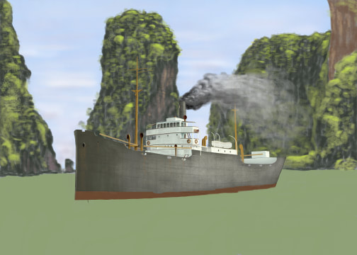 I recently bought my wife an iPad Pro, and she graciously allows me to work with the Procreate digital painting app that we loaded on there. I also bought the necessary Apple Pencil, and started learning the pros/cons, strengths and limitations of the app. Overall, it's a very positive experience, but if you're used to drawing on a Cintiq or other digital drawing monitor, you'll find there's some processes that are different and require working around. If anyone's interested, I'll delve into more details, but in the meantime, here's a short video of my Norman Rockwell sailor study. We'd been out in the back yard on a beautiful summer afternoon last year, and while we were getting ready to throw dinner on the grill, I'd taken a few photos of Arleigh basking in the warm sun. She looked so content - we'd been playing with her, throwing her favorite soccer balls around and she'd jump in the air trying to catch water we'd toss up from buckets. The pictures came out beautifully, and as I was going through photos looking for inspiration for my next painting, I came across those of Arleigh. Step one for me is cropping the original image so that it captures only what I'm looking for. I really wanted to focus on Arleigh's eyes, so the painting would just be her head and upper body with sunlit green grass faded in the background. Once decided and done, it was time to start sketching. I started with a rough pencil sketch to get the shape and major physical components. 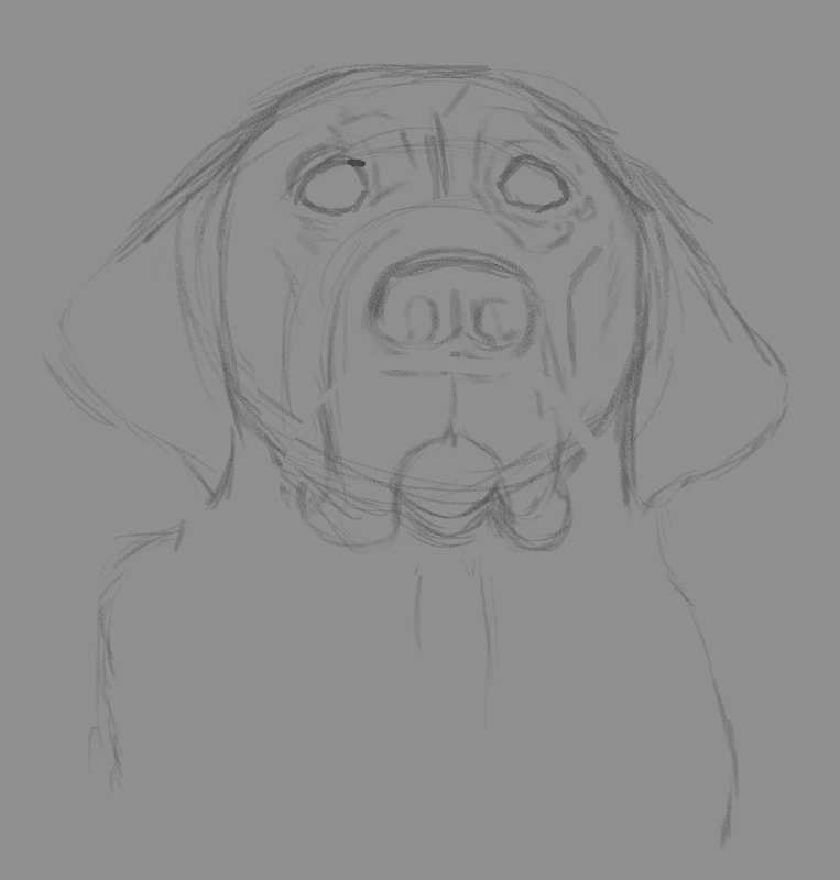 Once the initial rough sketch was worked out, I moved on to a more refined pencil sketch, adding additional details, darkening the line work, adding and subtracting a bit until I'm satisfied. 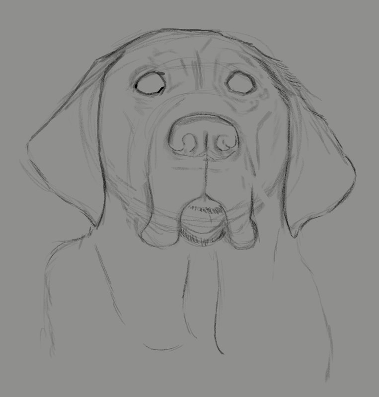 Next up, laying down local color. On a new layer in Photoshop, I carefully examine the subject photo and look for thee middle ground, color-wise. With the bright sun on a black dog, the median color is more of a purplish blue, and it looked odd when I painted it. But I figured if I get it wrong, I'd just delete the layer and begin again. Also, the eyes look very odd with just that middle of the road color, but as I proceeded to the following steps, it worked out pretty well. 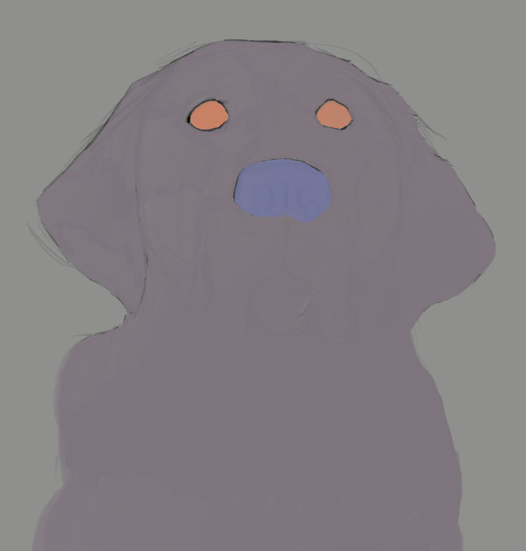 With the odd-looking local colors added, it was time to begin adding values. The process I'd learned was to start adding darks in a new layer, then one for lights, then back to darks and so on, working back and forth subtly until the painting reaches the point of completion. 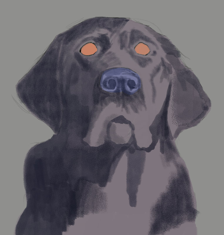 This is where the painting process gets really enjoyable - where the painting begins to take on life. The hazard is, for me, I get so anxious to get to all the detail areas, like the eyes so I can see what they'll look like, but restraint is necessary. Being patient and working gradually between darks and lights to give the subject dimension - that's how to get to a painting worth keeping. 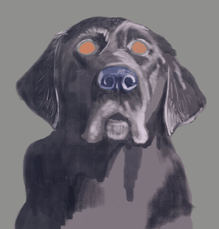 The painting was really starting to come together with the first lighter values pass. Lightening up the fur around her mouth and adding the lighter areas on the more prominent features of her head and torso started giving a more life-like appearance to Arleigh. 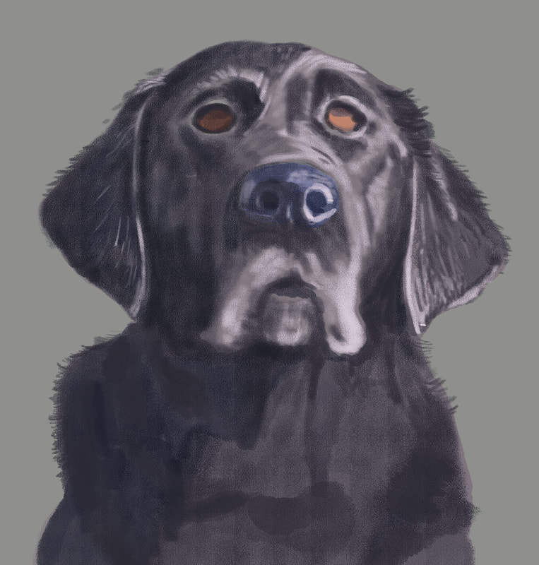 With the next pass, I added more shadow to her torso, and started giving some attention to her eyes. Due to the position of the sun, there was a cast shadow that deepened the color on the upper half of her eyes. 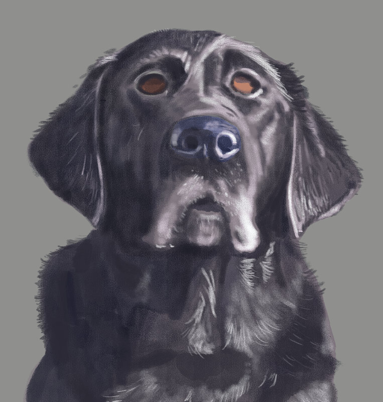 At this point, I started adding some reflected light onto her shiny fur, and to the features of her head most affected by the sunlight.  For this shadow pass, I added dark, thin lines amid the light to give more dimension to her fur, and lightly painted in the reddish brown that could be seen in the bright sunlight. 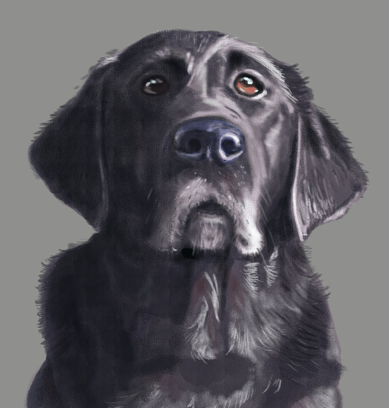 This was the final pass before focusing on the background. I added the reflection on the eyes, which really makes the painting come to life, as well as small spots along the bottom eyelid to create the look of wetness. I was really happy how this came out, and now I had to figure the best way to add appropriate background. What I decided to do was photobash - the process of taking a photo, or a piece of a photo to add an element to a painting, so that the different forms of media come together seamlessly. In the series of photos I'd taken that day was a patch of lawn that would work. I imported it into Photoshop, cropped out everything but a square patch of grass, the manipulated brightness, contrast, hue and saturation, and finished up with the gausian blur tool to put Arleigh prominently in the foreground and the lawn, as it would be, out of focus in the background. 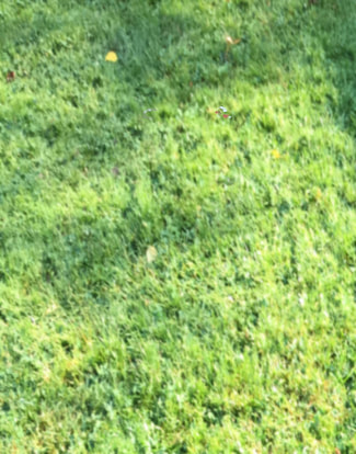 Final, complete painting. I was pleased with what I'd learned by creating this image, and look forward to creating many more, branching out into subjects that are more challenging and require more proficiency and some risk. I neglected to mention in the beginning, but this painting was created using Photoshop CS5 (I have a subscription to the latest Adobe products, but I'm a creature of habit and love this older version of Photoshop.) on a Wacom Cintiq 24" HD monitor. In the end, I had something like a dozen or so layers, and the image was created at 300 dpi. I only used one brush, and it was one I purchased from Creatureartteacher.com - the Aaron Blaise website where I've purchased many of his digital painting courses. The actual brush name is Pastel C - it's got a great texture and I love the results I can get with it. I use it for both penciling and painting. Many thanks for reading, and I hope you enjoyed. Now, on to the next one ... 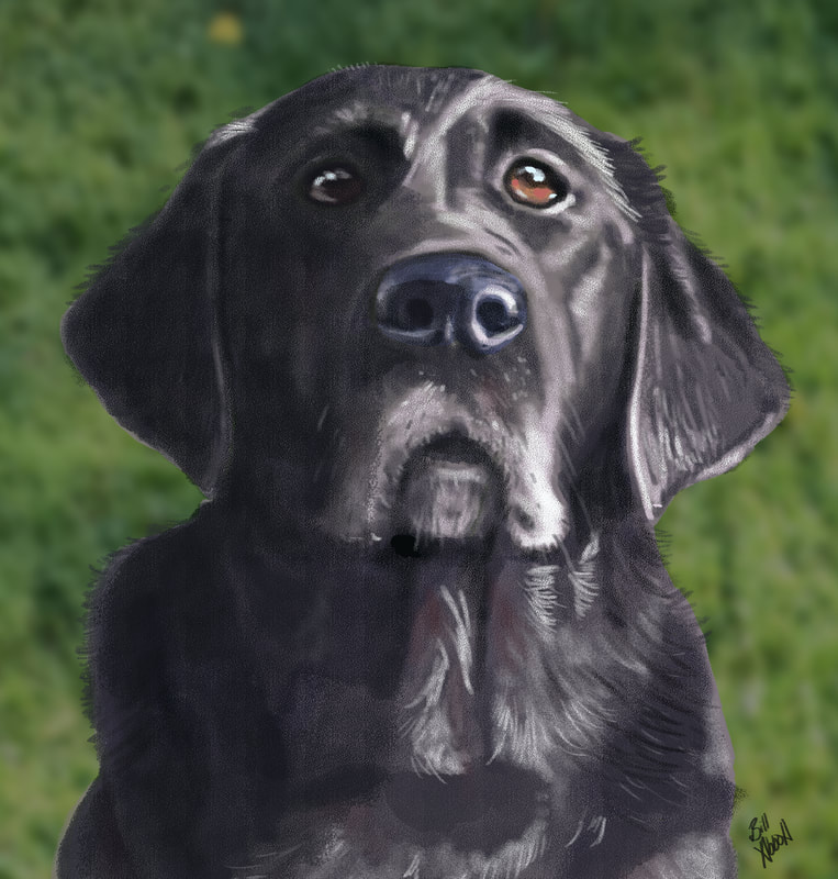 I ended the first part of this 2 part series with a more or less completed painting of my Black Lab, Arleigh, but no background or other elements. To remedy that, I wanted the painting to tell a story, and whatever I was to add to it needed to be in service of that. Arleigh is definitely an alpha dog - she has to be in charge. As a cartoonist, I often write using juxtaposition as a launch point for creating humor, and that's what I did here.  I decided I would add a cute kitten and Arleigh's bed. The expression on Arleigh's face could be interpreted in a variety of ways, but when I looked at it, a rough scene or scenario sprang to mind. Step one, I needed to find visual references to add to the painting. Arleigh's bed was easy and accessible, although I knew I'd need to modify it to add more to the story of the picture. I also needed it to be in at least somewhat similar lighting conditions, so I placed near a window and took this image. 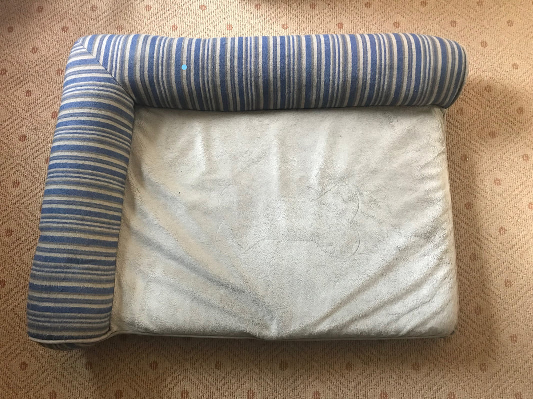 Next up, I needed a cute sleeping kitten image, so I put on my thinking cap and pondered the search phrases I would need to use to find just what I was looking for, and came up with, "sleeping kitten image." Brilliant, no? I couldn't the colors and pose I wanted, so I studied several photos and created my own. Like a Doctor Frankenstein of kittens. So I've got that going for me. Next up, I needed to elongate the canvas so I could situate the additional elements into the painting. I kept everything at 300dpi, so my computer wouldn't protest too much under the strain. Next up, a rough sketch of Arleigh's bed with a few enhancements and simplifications to better tell the story, and not push my very limited digital painting skills. 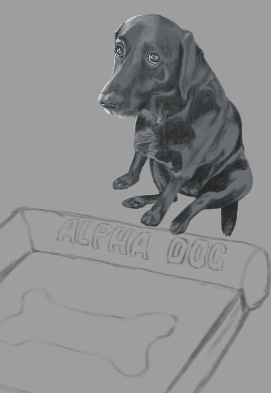 Nest up was the sketch of the kitten. I rough penciled it in and placed it where I thought it made most sense for our visual story. 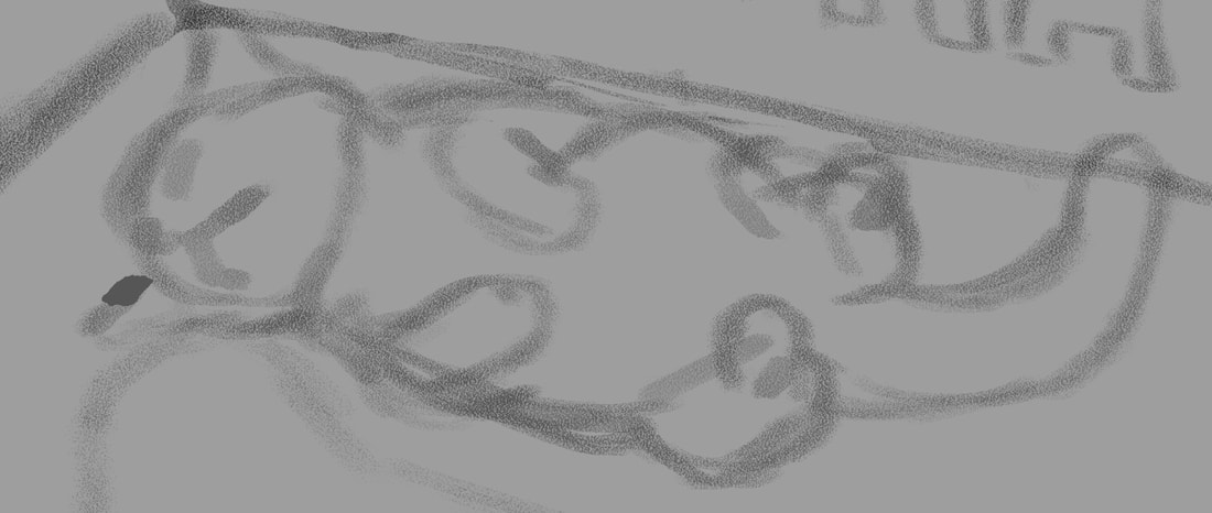 Next on the list was to start adding local color, or the color of an object as it is without being overly influenced by light or shadow. 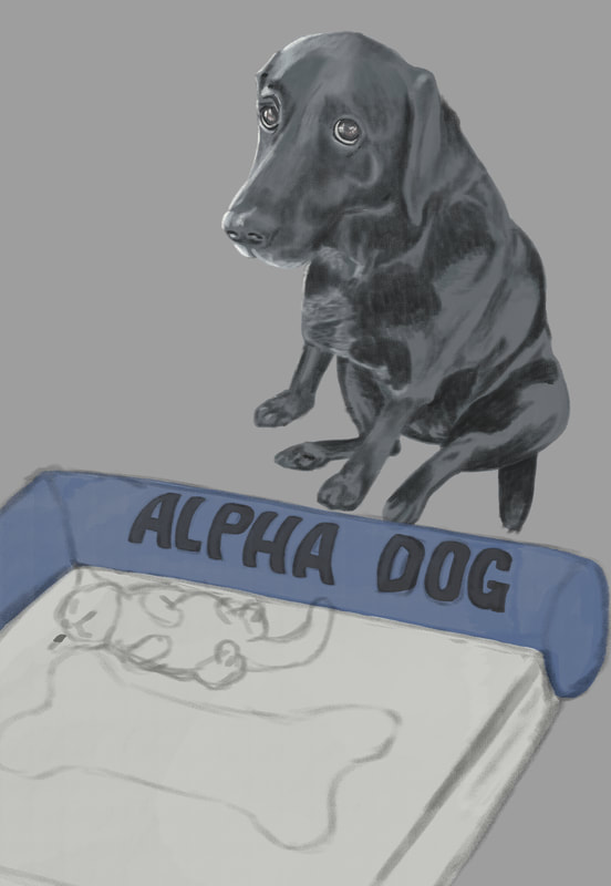 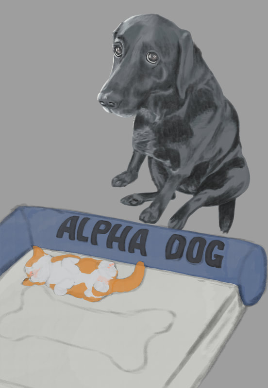 Once all the elements were added and the local color decided on (I couldn't find any kittens with that specific coloring - I wanted the orange to balance the blue of the bed, so I came up with that color mix for its fur), it was time to add values. One of the things I've heard repeated in virtually all of the digital painting courses I've taken is push and pull - to go back and forth between dark and light as you work your painting. So I started with a shadow layer, then a layer for adding lighter areas, then back and forth till all of the values were completed, or at least as complete as I could make them. After a final pass of subtle light and shadow, I needed background. I wanted something simple to keep the eyes on the subjects in the painting, and we happen to have a wood floor in our home. I didn't like any of the photos I had, so I did an internet search for "old wood floors" and found one that might work. I changed the orientation to match the setting, the adjusted hue/saturation and color balance, added a soft light coming from the left of the image to match the light on the subjects, the finished with a gausian blur to keep the subjects clear in the foreground. It didn't come out quite as I'd hoped - the light doesn't match as it should, there are a good number of imperfections in both the drawings and the painting, but I consider this one of the steps in a much longer learning process. You have to step in the arena no matter your perceived imperfections in skill. That's where the skill will be acquired - in the doing. So here's mine, warts and all, and on to the next. 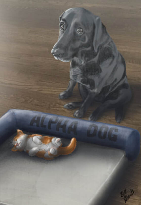 I've mentioned them a bunch of times, but one of the things I enjoy most is watching and learning from artists whose work just blows me away. Recently, I've purchased online digital painting classes from Aaron Blaise (creatureartteacher.com), Schoolism.com, SVSLearn.com, and ctrlpaint.com - all well worth every penny. One thing I learned early in life is that you've gained little if what you've been taught isn't put into practice. Aaron Blaise's digital painting course includes a demonstration of him creating a beautiful rendering of a lion, and he walks you through the process as he draws it. Using a Cintiq MobileStudio Pro 16", I parked my butt in front of the screen and started drawing along with him. The result was this picture, which is far from perfect, but I'm pretty happy with it, all things considered. 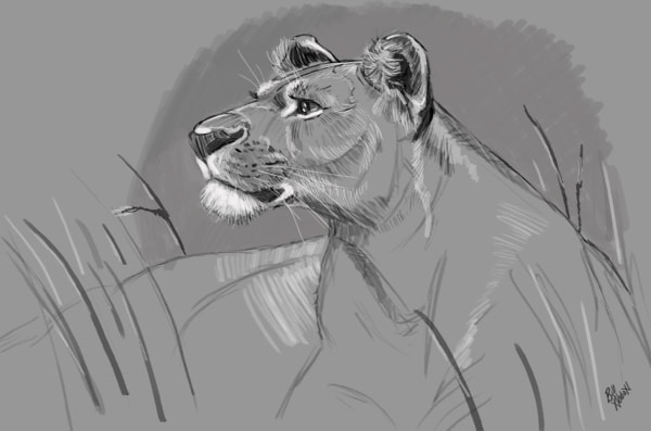 After this piece was completed, I wanted to try a digital painting that was entirely unique to me, so I went through photos I'd taken, and came across this one of our dog, Arleigh. She's a beautiful Black Lab, and in this picture, she'd just jumped up on our couch. We tried to discourage her from getting onto the furniture, and she knew she wasn't supposed to (the expression on her face tells it all), but it was a rule we infrequently enforced. I had to get a picture of her in that moment, and I thought it would make a fun painting, although I also thought it might be way above my skill level. 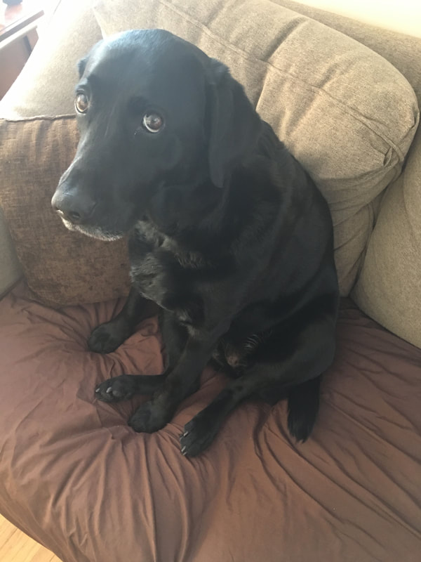 Step one would be creating a pencil sketch, albeit a digital one, to get the ball rolling. I'd just purchased a Cintiq 24" HD, and this was the first project I'd be undertaking with it. I'd gotten down a very rough drawing, then came in with more detail. Truthfully, I really didn't like what I'd ended up with and was going to scrap the drawing and move on to something easier. But then I thought, am I sacrificing the good with the valuable experience that will come from it in pursuit of an unrealistic, at least at this point in my development, ideal? I decided to charge ahead. 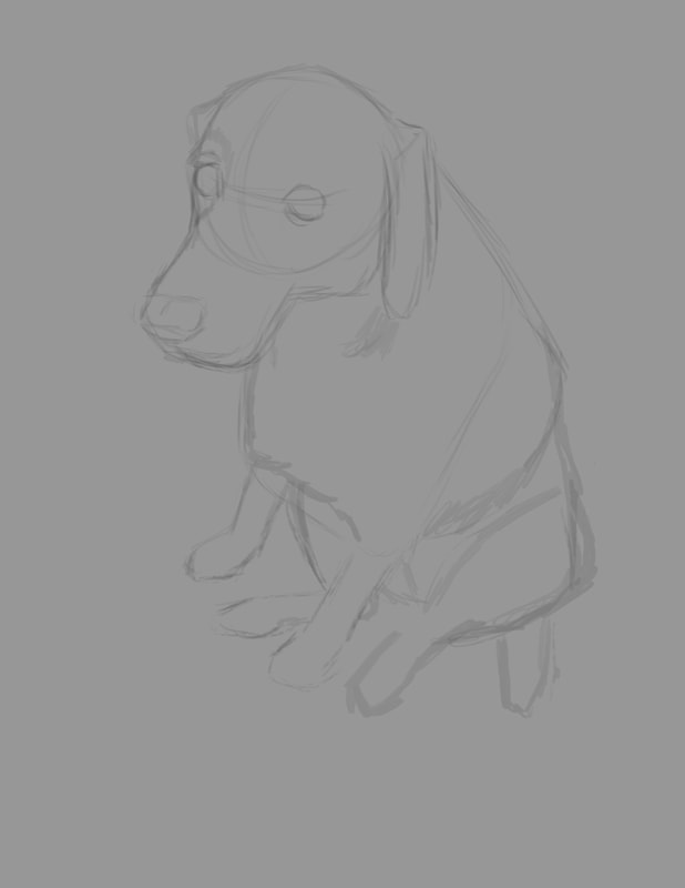 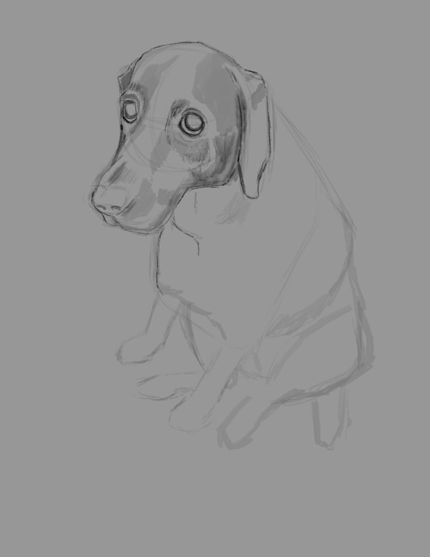 Once I got the sketch far enough along that it was sufficient to act as a guide for the painting, I created a new layer and painted in the local color, or the overall color of Arleigh's fur in a tone slightly brighter than the actual color. 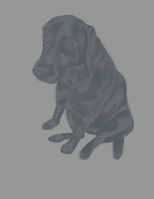 At this point in the process, I locked the local color layer and started adding darker values to it. At first, I'd intended to do any added values on their own layers respectively, but I'd gotten started on the values layer and was too far into it to turn back, so I rolled with it. Once I was satisfied with the first run of darker values, I created a new layer and began adding lighter values. One of the things I took onboard from the Aaron Blaise course was to work back and forth - dark then light, back to dark and so on. I found this process works really well. 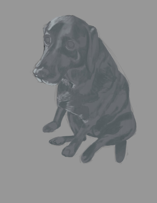 After the initial brighter values were added, it was back to the darker values again. I used the color picker in Photoshop, and dropped the lighter blue gray to a deeper shade, and I then dropped the opacity of the brush to somewhere around 70%. I also had the pressure sensitivity set, so that the lighter I touched the screen, the less pigment I would add, resulting in a more controlled feel.  If there is any one element that creates the emotion captured in the picture, it's Arleigh's eyes. I decided to paint Arleigh's eyes on a separate layer, expecting to screw them up. Luckily, I didn't and while not perfect, I'm pretty pleased with the effort. 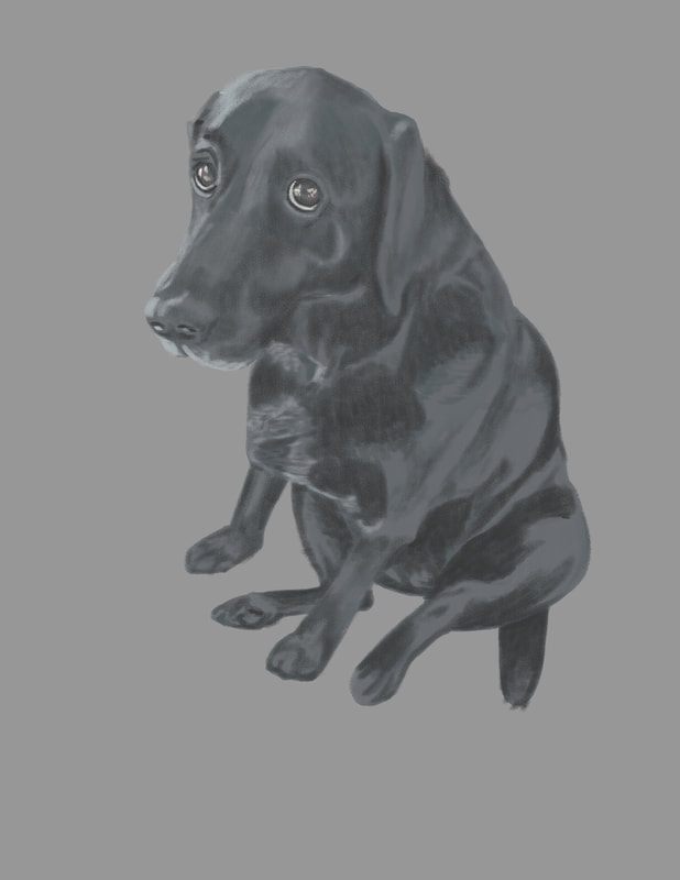 The last element I wanted to add to the figure of Arleigh was a technique used a good deal to wonderful effect, again by Aaron Blaise - very subtle rim lighting. If not overdone and crudely blatant, it adds a touch of drama to the painting. For a guy who's more at home with a hammer or a rifle, I'm pleased with this first independent effort. I learned a huge amount by doing this painting, and I hope to build on it as I get to work on the next one. But before I start anew, I have a background in mind for this Arleigh painting, which will be pretty challenging - if I can pull it off at all. Once that's complete, I'll add a second half to this blog post explaining how I did it. Thank you for letting me share this with you.
|
AuthorIllustrator and Cartoonist Archives
February 2022
Categories |
 RSS Feed