|
I recently bought my wife an iPad Pro, and she graciously allows me to work with the Procreate digital painting app that we loaded on there. I also bought the necessary Apple Pencil, and started learning the pros/cons, strengths and limitations of the app. Overall, it's a very positive experience, but if you're used to drawing on a Cintiq or other digital drawing monitor, you'll find there's some processes that are different and require working around. If anyone's interested, I'll delve into more details, but in the meantime, here's a short video of my Norman Rockwell sailor study.
0 Comments
We'd been out in the back yard on a beautiful summer afternoon last year, and while we were getting ready to throw dinner on the grill, I'd taken a few photos of Arleigh basking in the warm sun. She looked so content - we'd been playing with her, throwing her favorite soccer balls around and she'd jump in the air trying to catch water we'd toss up from buckets. The pictures came out beautifully, and as I was going through photos looking for inspiration for my next painting, I came across those of Arleigh. Step one for me is cropping the original image so that it captures only what I'm looking for. I really wanted to focus on Arleigh's eyes, so the painting would just be her head and upper body with sunlit green grass faded in the background. Once decided and done, it was time to start sketching. I started with a rough pencil sketch to get the shape and major physical components. 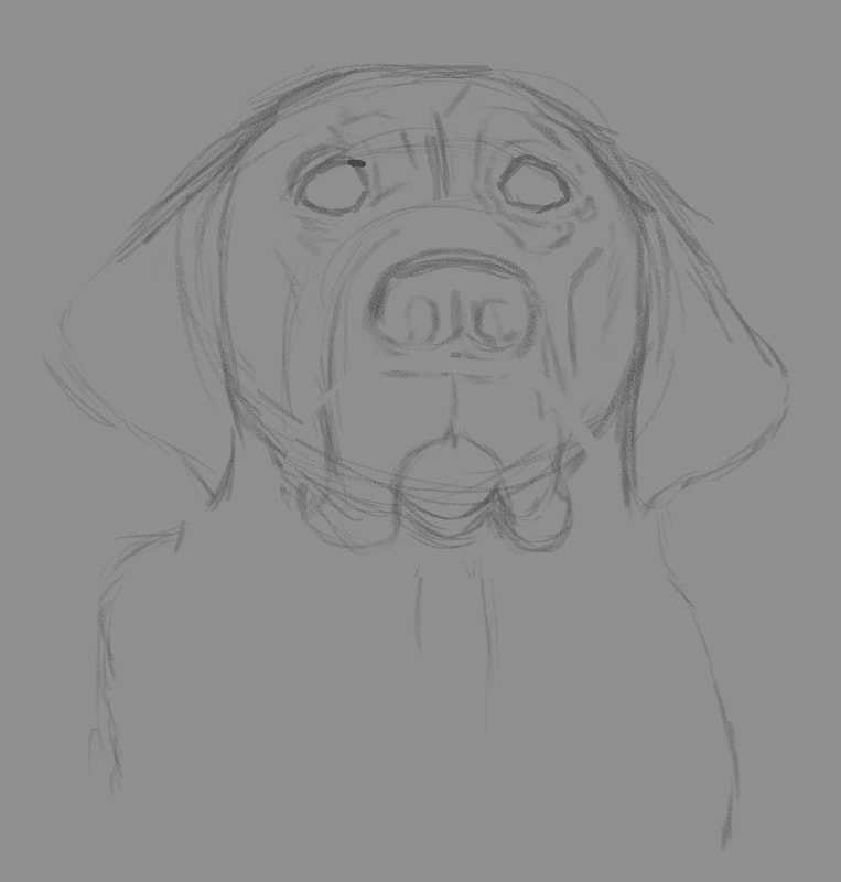 Once the initial rough sketch was worked out, I moved on to a more refined pencil sketch, adding additional details, darkening the line work, adding and subtracting a bit until I'm satisfied. 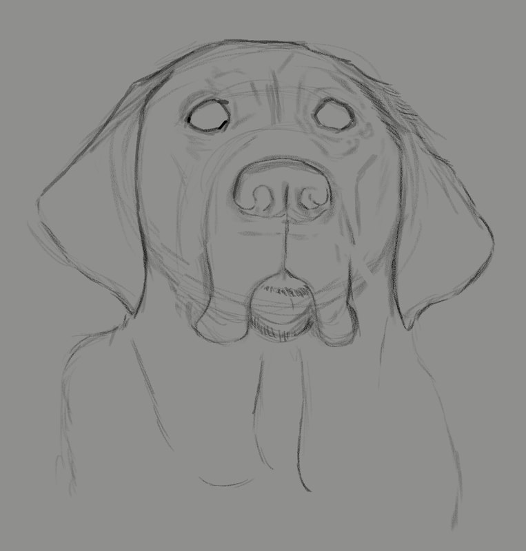 Next up, laying down local color. On a new layer in Photoshop, I carefully examine the subject photo and look for thee middle ground, color-wise. With the bright sun on a black dog, the median color is more of a purplish blue, and it looked odd when I painted it. But I figured if I get it wrong, I'd just delete the layer and begin again. Also, the eyes look very odd with just that middle of the road color, but as I proceeded to the following steps, it worked out pretty well. 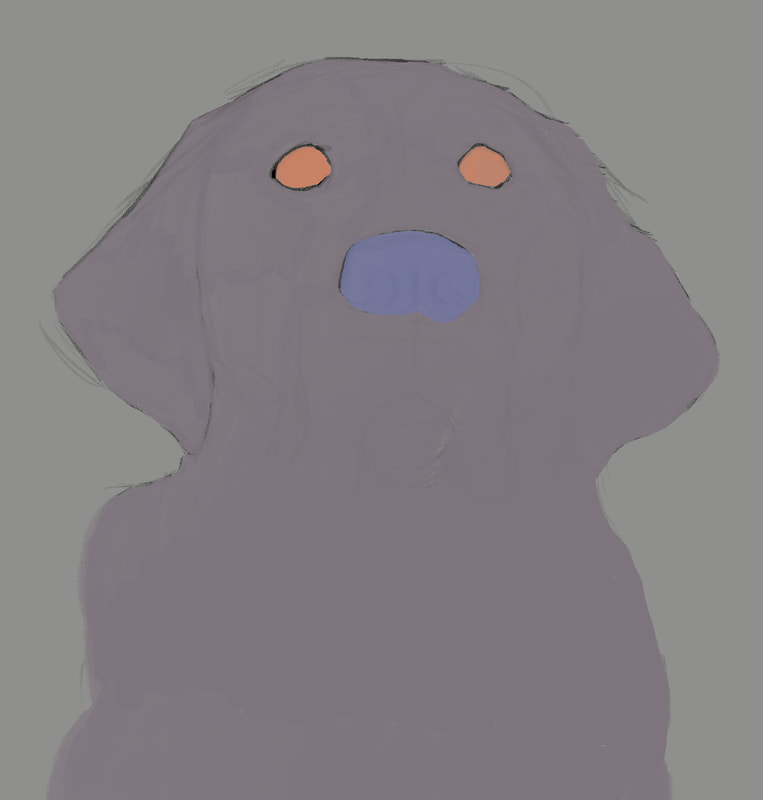 With the odd-looking local colors added, it was time to begin adding values. The process I'd learned was to start adding darks in a new layer, then one for lights, then back to darks and so on, working back and forth subtly until the painting reaches the point of completion. 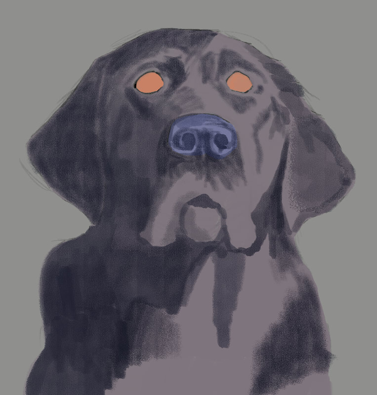 This is where the painting process gets really enjoyable - where the painting begins to take on life. The hazard is, for me, I get so anxious to get to all the detail areas, like the eyes so I can see what they'll look like, but restraint is necessary. Being patient and working gradually between darks and lights to give the subject dimension - that's how to get to a painting worth keeping. 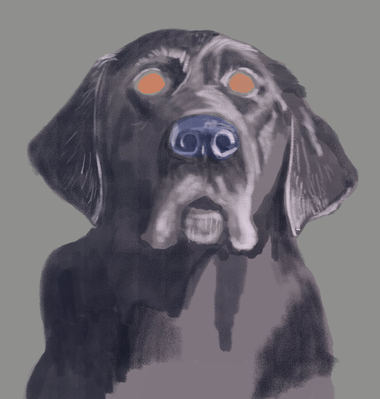 The painting was really starting to come together with the first lighter values pass. Lightening up the fur around her mouth and adding the lighter areas on the more prominent features of her head and torso started giving a more life-like appearance to Arleigh. 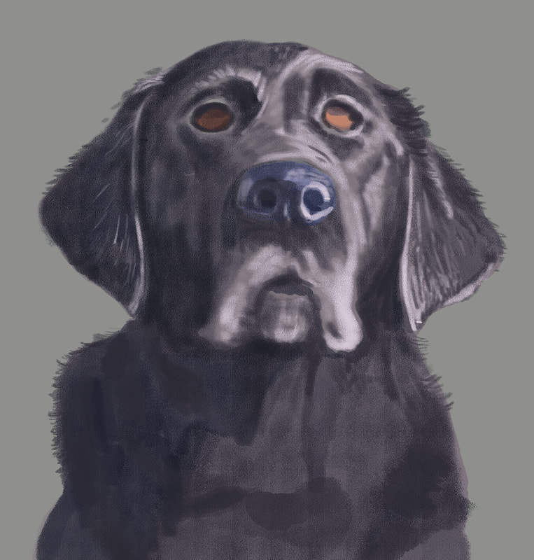 With the next pass, I added more shadow to her torso, and started giving some attention to her eyes. Due to the position of the sun, there was a cast shadow that deepened the color on the upper half of her eyes. 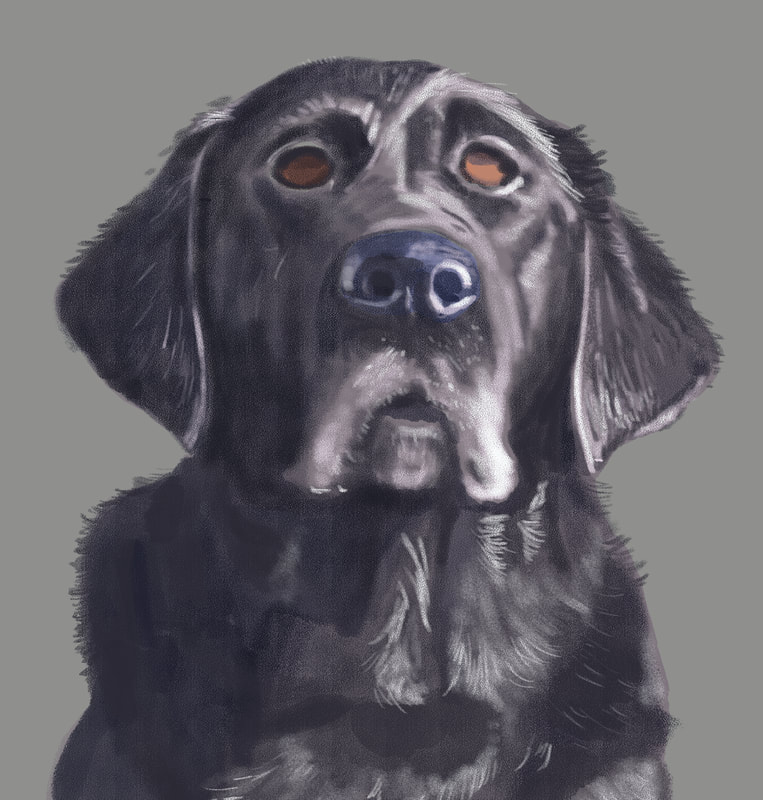 At this point, I started adding some reflected light onto her shiny fur, and to the features of her head most affected by the sunlight.  For this shadow pass, I added dark, thin lines amid the light to give more dimension to her fur, and lightly painted in the reddish brown that could be seen in the bright sunlight. 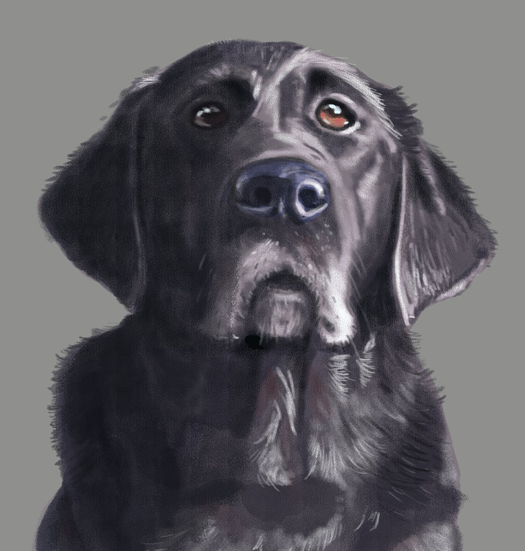 This was the final pass before focusing on the background. I added the reflection on the eyes, which really makes the painting come to life, as well as small spots along the bottom eyelid to create the look of wetness. I was really happy how this came out, and now I had to figure the best way to add appropriate background. What I decided to do was photobash - the process of taking a photo, or a piece of a photo to add an element to a painting, so that the different forms of media come together seamlessly. In the series of photos I'd taken that day was a patch of lawn that would work. I imported it into Photoshop, cropped out everything but a square patch of grass, the manipulated brightness, contrast, hue and saturation, and finished up with the gausian blur tool to put Arleigh prominently in the foreground and the lawn, as it would be, out of focus in the background. 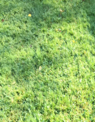 Final, complete painting. I was pleased with what I'd learned by creating this image, and look forward to creating many more, branching out into subjects that are more challenging and require more proficiency and some risk. I neglected to mention in the beginning, but this painting was created using Photoshop CS5 (I have a subscription to the latest Adobe products, but I'm a creature of habit and love this older version of Photoshop.) on a Wacom Cintiq 24" HD monitor. In the end, I had something like a dozen or so layers, and the image was created at 300 dpi. I only used one brush, and it was one I purchased from Creatureartteacher.com - the Aaron Blaise website where I've purchased many of his digital painting courses. The actual brush name is Pastel C - it's got a great texture and I love the results I can get with it. I use it for both penciling and painting. Many thanks for reading, and I hope you enjoyed. Now, on to the next one ... 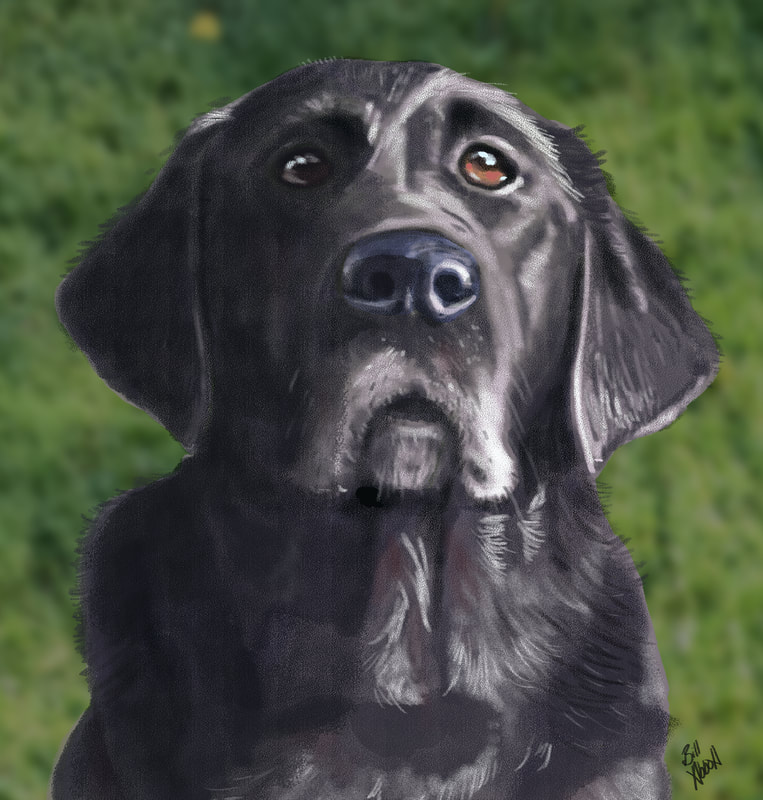 I ended the first part of this 2 part series with a more or less completed painting of my Black Lab, Arleigh, but no background or other elements. To remedy that, I wanted the painting to tell a story, and whatever I was to add to it needed to be in service of that. Arleigh is definitely an alpha dog - she has to be in charge. As a cartoonist, I often write using juxtaposition as a launch point for creating humor, and that's what I did here.  I decided I would add a cute kitten and Arleigh's bed. The expression on Arleigh's face could be interpreted in a variety of ways, but when I looked at it, a rough scene or scenario sprang to mind. Step one, I needed to find visual references to add to the painting. Arleigh's bed was easy and accessible, although I knew I'd need to modify it to add more to the story of the picture. I also needed it to be in at least somewhat similar lighting conditions, so I placed near a window and took this image. 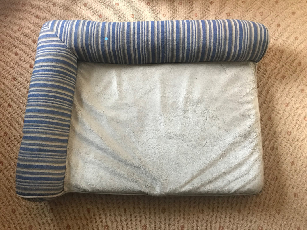 Next up, I needed a cute sleeping kitten image, so I put on my thinking cap and pondered the search phrases I would need to use to find just what I was looking for, and came up with, "sleeping kitten image." Brilliant, no? I couldn't the colors and pose I wanted, so I studied several photos and created my own. Like a Doctor Frankenstein of kittens. So I've got that going for me. Next up, I needed to elongate the canvas so I could situate the additional elements into the painting. I kept everything at 300dpi, so my computer wouldn't protest too much under the strain. Next up, a rough sketch of Arleigh's bed with a few enhancements and simplifications to better tell the story, and not push my very limited digital painting skills. 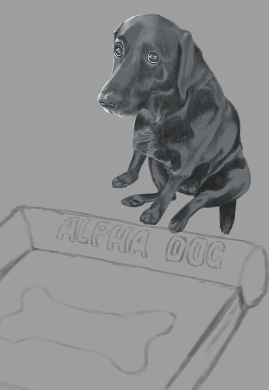 Nest up was the sketch of the kitten. I rough penciled it in and placed it where I thought it made most sense for our visual story.  Next on the list was to start adding local color, or the color of an object as it is without being overly influenced by light or shadow. 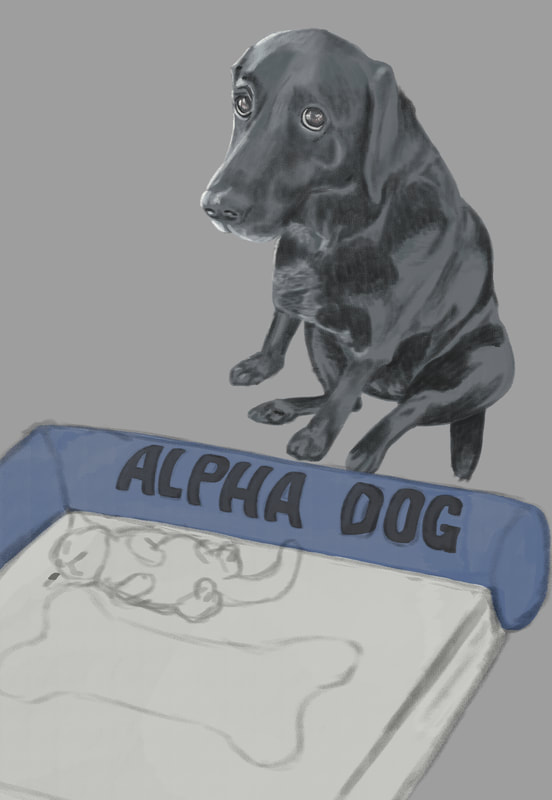 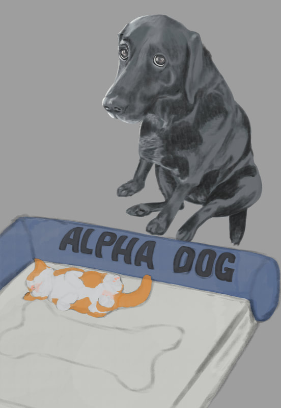 Once all the elements were added and the local color decided on (I couldn't find any kittens with that specific coloring - I wanted the orange to balance the blue of the bed, so I came up with that color mix for its fur), it was time to add values. One of the things I've heard repeated in virtually all of the digital painting courses I've taken is push and pull - to go back and forth between dark and light as you work your painting. So I started with a shadow layer, then a layer for adding lighter areas, then back and forth till all of the values were completed, or at least as complete as I could make them. After a final pass of subtle light and shadow, I needed background. I wanted something simple to keep the eyes on the subjects in the painting, and we happen to have a wood floor in our home. I didn't like any of the photos I had, so I did an internet search for "old wood floors" and found one that might work. I changed the orientation to match the setting, the adjusted hue/saturation and color balance, added a soft light coming from the left of the image to match the light on the subjects, the finished with a gausian blur to keep the subjects clear in the foreground. It didn't come out quite as I'd hoped - the light doesn't match as it should, there are a good number of imperfections in both the drawings and the painting, but I consider this one of the steps in a much longer learning process. You have to step in the arena no matter your perceived imperfections in skill. That's where the skill will be acquired - in the doing. So here's mine, warts and all, and on to the next. 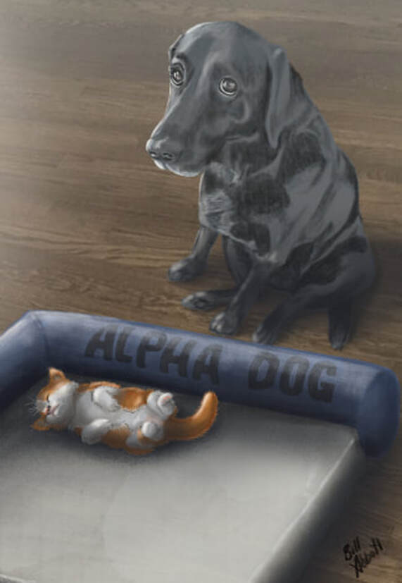 I've mentioned them a bunch of times, but one of the things I enjoy most is watching and learning from artists whose work just blows me away. Recently, I've purchased online digital painting classes from Aaron Blaise (creatureartteacher.com), Schoolism.com, SVSLearn.com, and ctrlpaint.com - all well worth every penny. One thing I learned early in life is that you've gained little if what you've been taught isn't put into practice. Aaron Blaise's digital painting course includes a demonstration of him creating a beautiful rendering of a lion, and he walks you through the process as he draws it. Using a Cintiq MobileStudio Pro 16", I parked my butt in front of the screen and started drawing along with him. The result was this picture, which is far from perfect, but I'm pretty happy with it, all things considered. 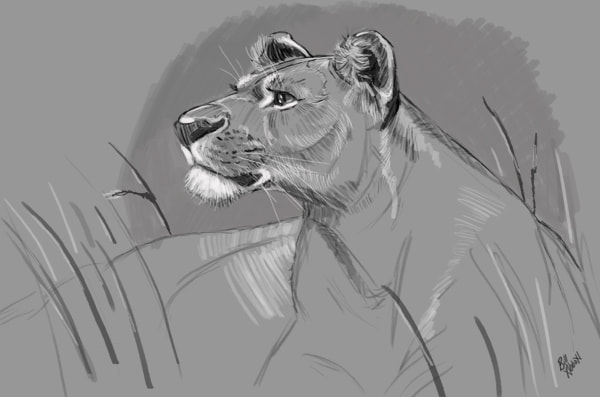 After this piece was completed, I wanted to try a digital painting that was entirely unique to me, so I went through photos I'd taken, and came across this one of our dog, Arleigh. She's a beautiful Black Lab, and in this picture, she'd just jumped up on our couch. We tried to discourage her from getting onto the furniture, and she knew she wasn't supposed to (the expression on her face tells it all), but it was a rule we infrequently enforced. I had to get a picture of her in that moment, and I thought it would make a fun painting, although I also thought it might be way above my skill level. 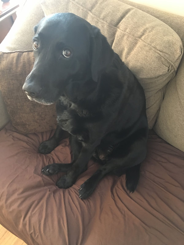 Step one would be creating a pencil sketch, albeit a digital one, to get the ball rolling. I'd just purchased a Cintiq 24" HD, and this was the first project I'd be undertaking with it. I'd gotten down a very rough drawing, then came in with more detail. Truthfully, I really didn't like what I'd ended up with and was going to scrap the drawing and move on to something easier. But then I thought, am I sacrificing the good with the valuable experience that will come from it in pursuit of an unrealistic, at least at this point in my development, ideal? I decided to charge ahead. 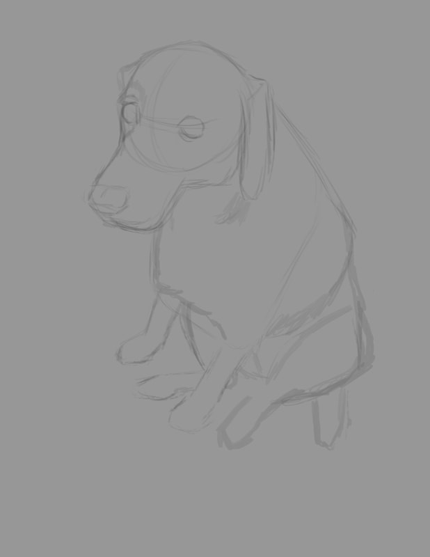 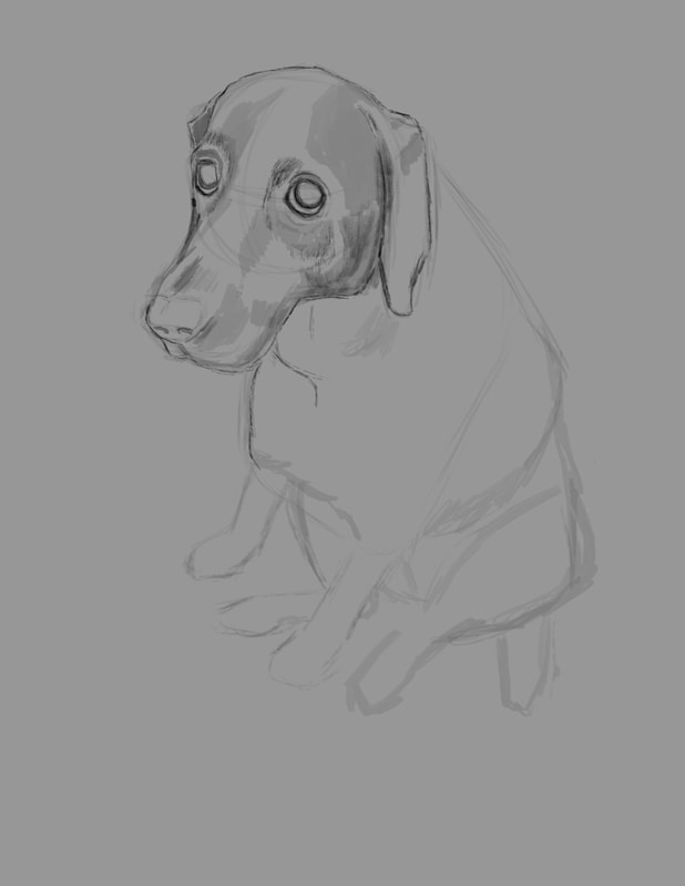 Once I got the sketch far enough along that it was sufficient to act as a guide for the painting, I created a new layer and painted in the local color, or the overall color of Arleigh's fur in a tone slightly brighter than the actual color. 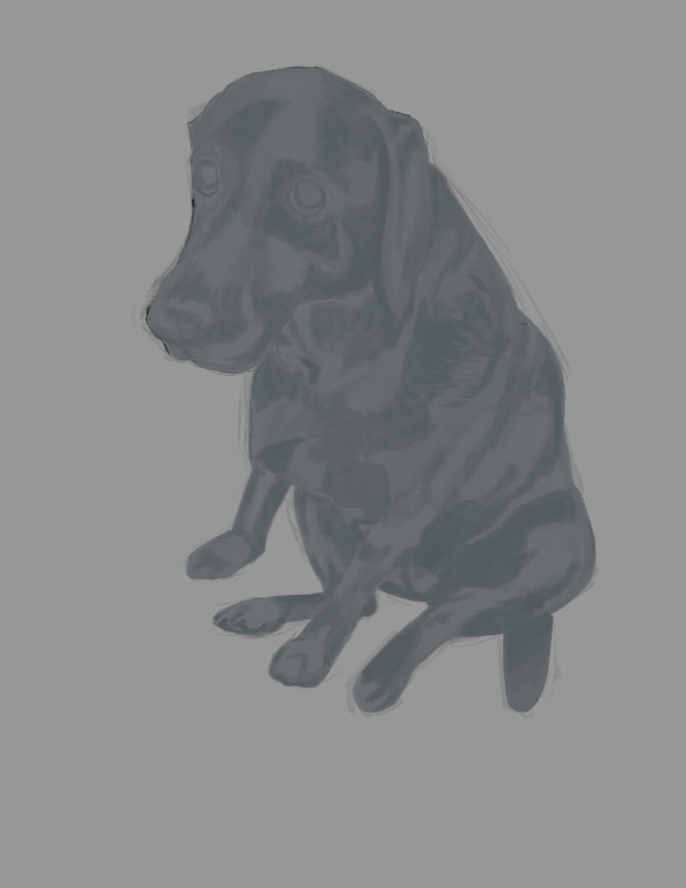 At this point in the process, I locked the local color layer and started adding darker values to it. At first, I'd intended to do any added values on their own layers respectively, but I'd gotten started on the values layer and was too far into it to turn back, so I rolled with it. Once I was satisfied with the first run of darker values, I created a new layer and began adding lighter values. One of the things I took onboard from the Aaron Blaise course was to work back and forth - dark then light, back to dark and so on. I found this process works really well. 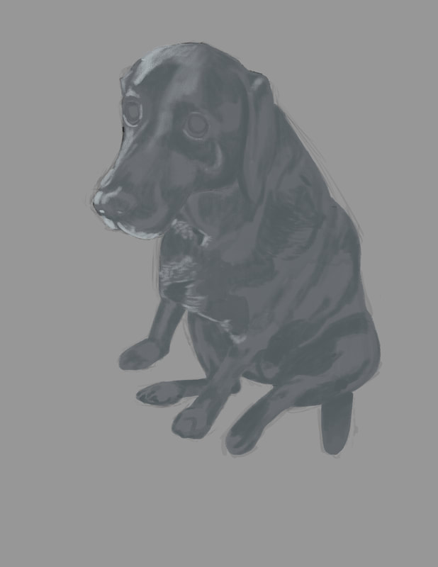 After the initial brighter values were added, it was back to the darker values again. I used the color picker in Photoshop, and dropped the lighter blue gray to a deeper shade, and I then dropped the opacity of the brush to somewhere around 70%. I also had the pressure sensitivity set, so that the lighter I touched the screen, the less pigment I would add, resulting in a more controlled feel.  If there is any one element that creates the emotion captured in the picture, it's Arleigh's eyes. I decided to paint Arleigh's eyes on a separate layer, expecting to screw them up. Luckily, I didn't and while not perfect, I'm pretty pleased with the effort. 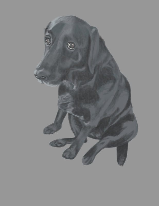 The last element I wanted to add to the figure of Arleigh was a technique used a good deal to wonderful effect, again by Aaron Blaise - very subtle rim lighting. If not overdone and crudely blatant, it adds a touch of drama to the painting. For a guy who's more at home with a hammer or a rifle, I'm pleased with this first independent effort. I learned a huge amount by doing this painting, and I hope to build on it as I get to work on the next one. But before I start anew, I have a background in mind for this Arleigh painting, which will be pretty challenging - if I can pull it off at all. Once that's complete, I'll add a second half to this blog post explaining how I did it. Thank you for letting me share this with you.
|
AuthorIllustrator and Cartoonist Archives
February 2022
Categories |
 RSS Feed